

Introduction
Imagine walking into a high-stake meeting where two teams are presenting their Power BI dashboards.
Team A’s Report: Clashing colors, an overwhelming sea of pie charts, and no clear insights. Trying to find useful information feels like deciphering an ancient script. Filters? Missing. Drill-throughs? Nonexistent. Every interaction is an exercise in frustration.
Team B’s Report: A beautifully structured dashboard with smooth navigation, clear visual hierarchy, and well-placed filters. Key metrics are highlighted, allowing decision-makers to get actionable insights in seconds. Need more details? A simple drill-through reveals deeper trends. Copilot answers ad-hoc questions in plain English. The result? A confident, data-driven discussion.
This guide will show you how to build reports like Team B structured, optimized, and impactful.
1. Power BI: The Secret Sauce of Smart Business Decisions
Why Power BI is a Game Changer
Power BI isn’t just another reporting tool it’s a business intelligence powerhouse that allows organizations to:
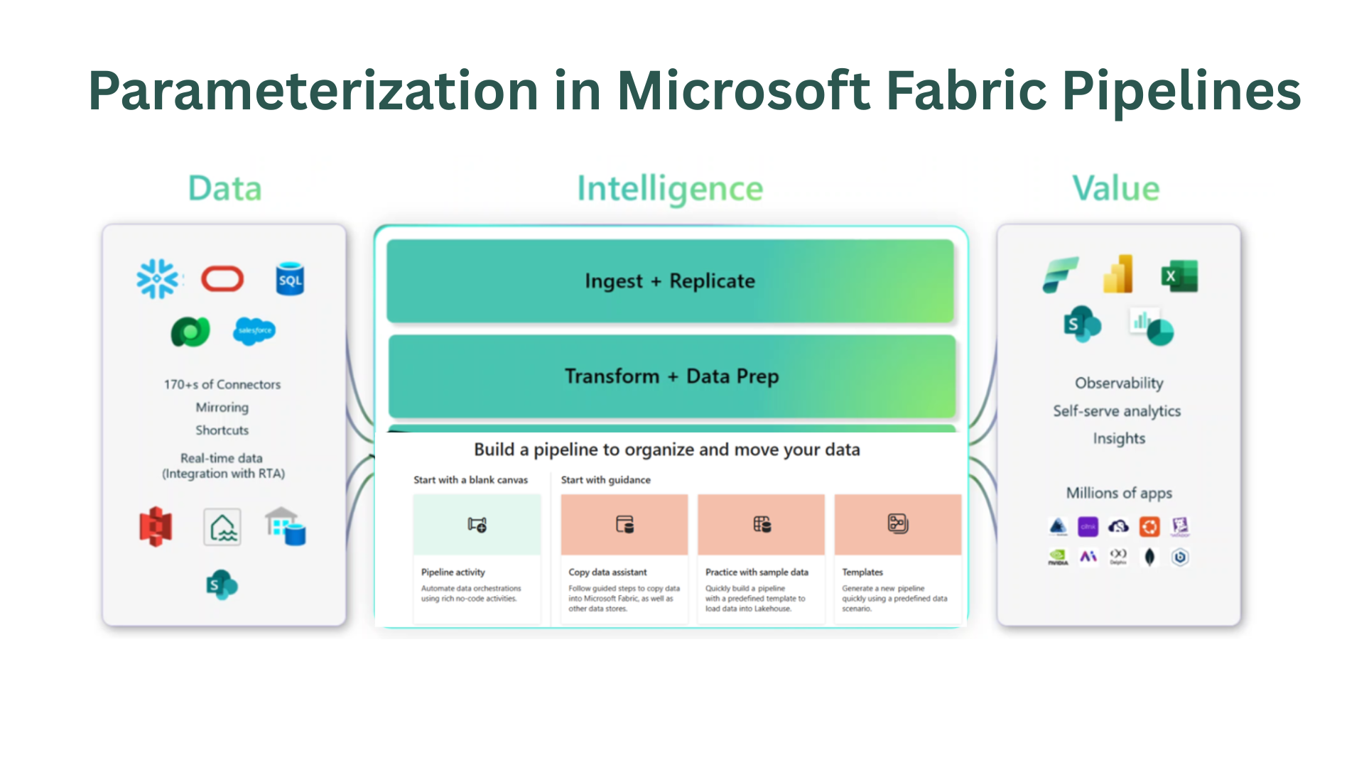
- Integrate data from multiple sources (SQL, Excel, Azure, APIs, Google Analytics, Salesforce).
- Build real-time, interactive dashboards that reflect business metrics instantly.
- Enable non-technical users to explore and analyze data without depending on IT.
- Predict trends with AI-powered analytics and machine learning models.
- Improve collaboration by embedding reports into Teams, SharePoint, and PowerPoint.
Supercharging Power BI with Copilot
Power BI’s Copilot AI takes decision-making to the next level. Here’s what it brings to the table:
- Ask questions in plain language: Instead of writing complex queries, just type “What are my top-performing regions this quarter?” and Copilot will generate insights.
- AI-powered recommendations: Copilot suggests relevant KPIs, and visualizations based on data trends.
- Automated insights: It detects anomalies, identifies patterns, and even suggests potential explanations.
- Report generation in seconds: Automate report creation and formatting, saving time for high-impact analysis.
Copilot turns Power BI into a true business assistant, making it easier than ever to explore data, find answers, and drive intelligent decision-making.
2. Power BI Optimization: How to Avoid a Slow, Messy Dashboard
A great Power BI report isn’t just about beautiful visuals, it needs to be fast, efficient, and insightful. Here’s how to optimize your reports:
Use Measures Instead of Calculated Columns
- Calculated columns store data in your model, increasing size and slowing down performance.
- Measures are calculated on-the-fly, making them more efficient for aggregations and summaries.
Reduce Data Model Bloat
- Remove unused columns and tables – Every unnecessary column slows down performance.
- Use summarized tables – Instead of importing massive raw datasets, pre-aggregate key metrics.
Optimize Relationships & Data Model Design
- Use a Star Schema instead of a Snowflake Schema for better performance.
- Reduce cardinality – Avoid excessive unique values in key columns.
Limit Visuals & Slicers
- Too many visuals slow down reports – Use fewer, more effective charts.
- Disable unnecessary cross-filtering – Every interaction between visuals triggers extra calculations.
Fine-Tune DAX Queries
- Use variables (VAR) in complex DAX formulas to store intermediate results and improve speed.
- Avoid FILTER inside CALCULATE unless necessary.
3. Building Power BI Dashboards That Drive Smart Decisions
A great Power BI dashboard is like a well-designed website, it should be intuitive, visually appealing, and easy to navigate. Here’s how to get it right:
The “Less is More” Approach
- Show only the most important KPIs. Don’t clutter your report with unnecessary visuals.
- Use drill-throughs instead of stuffing everything into one page.
🔹 Use the Right Visuals for the Right Data
- Bar charts for comparisons, line charts for trends, and cards for key figures.
- Avoid pie charts for anything other than simple proportions.
Following a Logical Layout
- Place the most critical insights at the top (Z-pattern reading flow).
- Group related data together and ensure easy navigation between pages. Choose a Consistent Color Palette
- Use colors strategically green for growth, red for decline, neutral tones for balance.
- Avoid excessive bright colors that can overwhelm users.
4. The Power BI Checklist: Before You Hit Publish
Before sharing your Power BI report, run through this quality checklist:
- Does your report tell a clear story? (Less clutter, more insights.)
- Are your visuals optimized? (Right chart types, no visual overload.)
- Is your report fast and responsive? (Optimized data model and calculations.)
- Have you applied role-based security? (Only the right people see the right data.)
- Is Copilot enabled? (Use AI to enhance user experience.)
If you want to create high-impact, optimized Power BI reports that drive business decisions, reach out to Armely at armely.com and let’s turn your data into actionable insights!